4 Months
Post Office
Updating and evolving a ‘one size fits all’ journey to a more personalised one that reassures, guides and builds certainty for users

The Challenge:
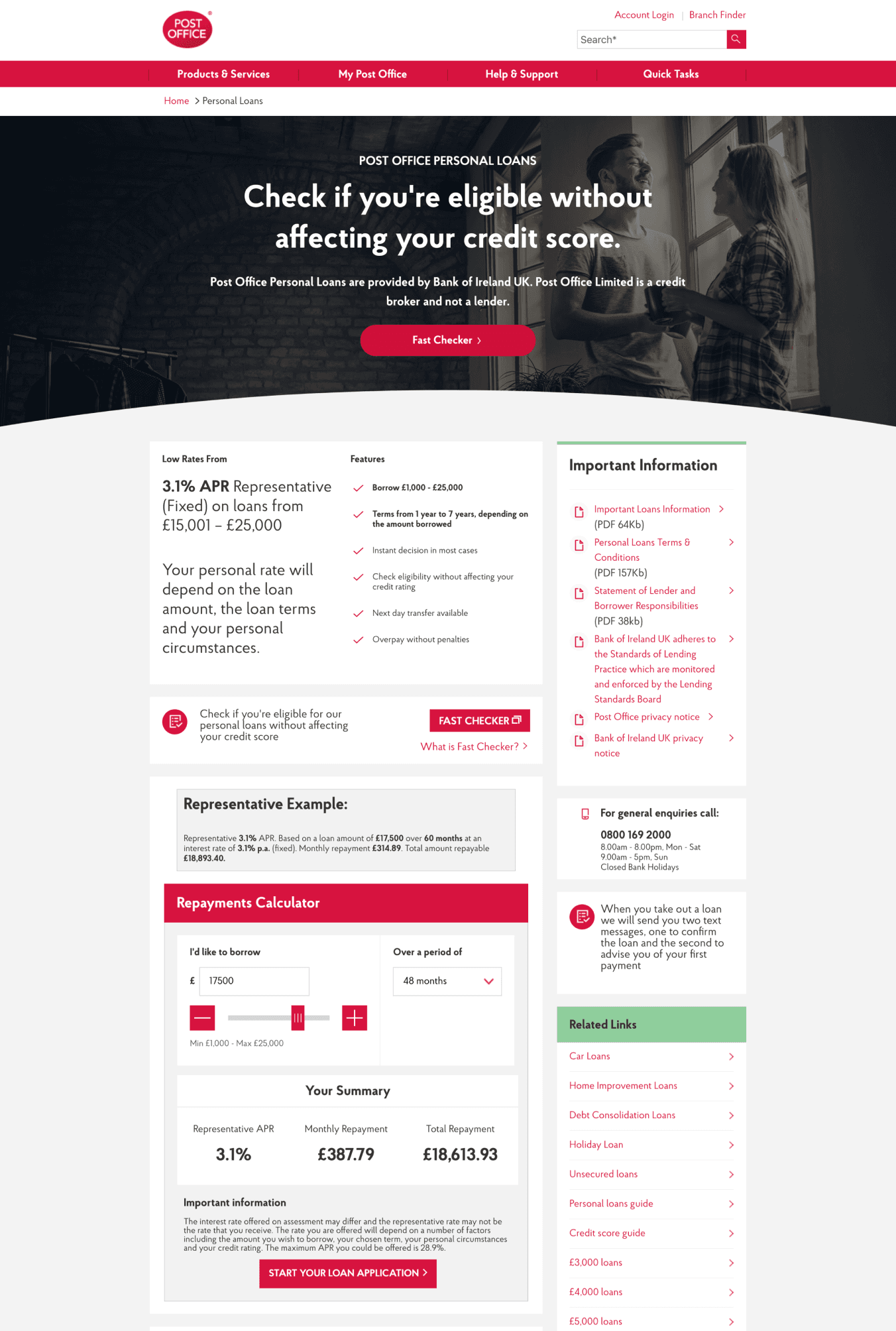
Personal loans at the Post Office had seen a steady growth year on year despite having an outdated customer experience that had not been given much attention or consideration. Different pages in the journey followed disparate templates and interfaces that had not been made consistent as the wider brand went through updates in UI and UX.
There was an opportunity to take a fresh look at the Loans customer experience from a user-centred approach, to see what can be optimised, updated and made consistent, to further build on that steady growth.
The Deliverables:
Desktop/Tablet/Mobile high fidelity wireframes
Interactive Prototype
User testing research
UI Direction
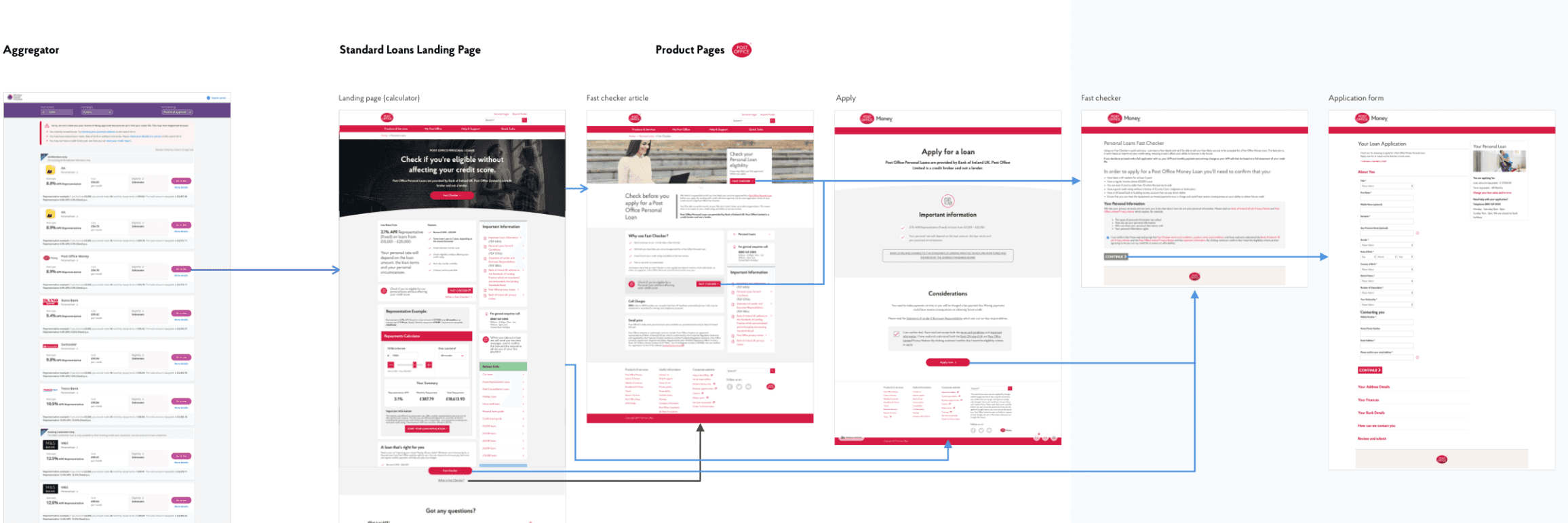
Current
Journey

Current Journey
Learnings from conversion analytics
Aggregate journey forces users to repeat work.
Soft credit checks are better for users as they are a good indicator of loan approval likelihood.
Inexperienced users are not likely to know about soft checks, and potentially risk affecting their credit score negatively with a unsuccessful hard credit check.
Time limit in the application funnel is catching users out
The problems to solve:
There is no dedicated journey for aggregator users. Users have to re-input information and effectively start again.
There’s no clear signposting or guidance towards ‘Fast Checker’ soft credit check.
The application funnel is effort heavy, time-consuming with no ability for users to save progress.
Making a difference
Opportunity for users
Create more personalised journeys for users
Serve users the relevant information and options based on their needs
Make the application journey as smooth as possible
Prepare users, have clear signposting and show user progress
Remove potential barriers at e-sign stage
Manage rate expectations and help users with time management

The New
Journey
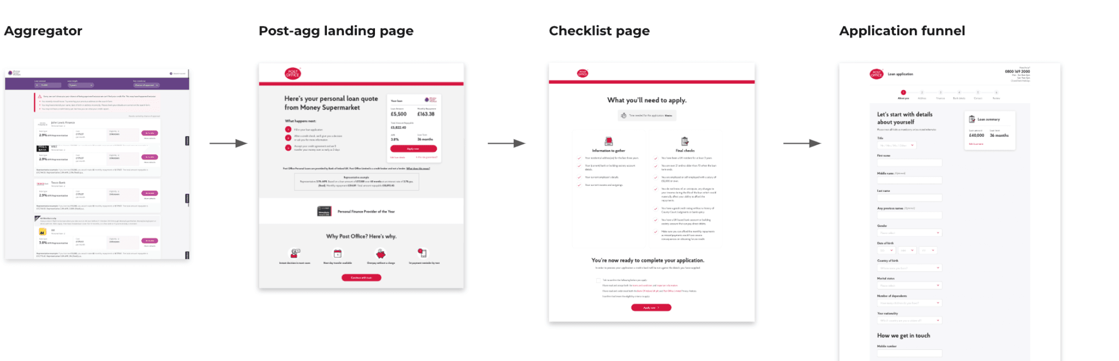
Old
4 pages to application. User arrives on standard landing page and re-inputs loan information.
New
2 pages to application. Data is carried from aggregator. Loan rate user has selected is consistent throughout.